


Wired to Eat: Glucose Tolerance Test

Ah yes, that dirty work, carbs… it’s back. I thought it would be interesting to see how / if different carbohydrate sources effect my blood glucose and AUC. Of course, as I was collecting data several other intersting observations, like fasting BG, dawn phenomenon, and circadian biology also warranted investigating.

As I’ve referenced many times, there are several reasons why I reintroduced carbohydrates back into my diet after about three years of carnivore. Since I haven’t done lab / blood work in a while I wanted to get some data on my blood glucose / A1C, but specifically how different carb sources effect BG area under the curve (AUC).
From a recent article by Robb (ref.):
“While using a blood glucose monitor, eat 25–50 grams of carbs from a single healthy source—like sweet potatoes, fruit, legumes, or white rice—in one sitting. Monitor the change in your blood glucose levels over the following two hours. The next day, repeat this experiment with a different source of carbs. Your goal is to identify which foods result in the smallest blood sugar bump 1 or 2 hours after eating.”
Robb has also commented that there is some value to gross glucose spikes rather than just area under the curve (AUC) — ~12:40 THRR179.
Figure 1 shows estimated A1C percentages based on blood glucose level. For reference, the data I’ve collected herein was obtained vi finger stick rather than CGM.

Figure 2 shows my actual data. You can see that with a large sample (N=74) I was generally well below the “normal” range of 120 — with a few flyers. Keep in mind that this data is somewhat skewed because it was specifically taken during high carb times and intentionally naked carb consumption. That is, carbs without additional fat or protein which would have dampened the postprandial spike.
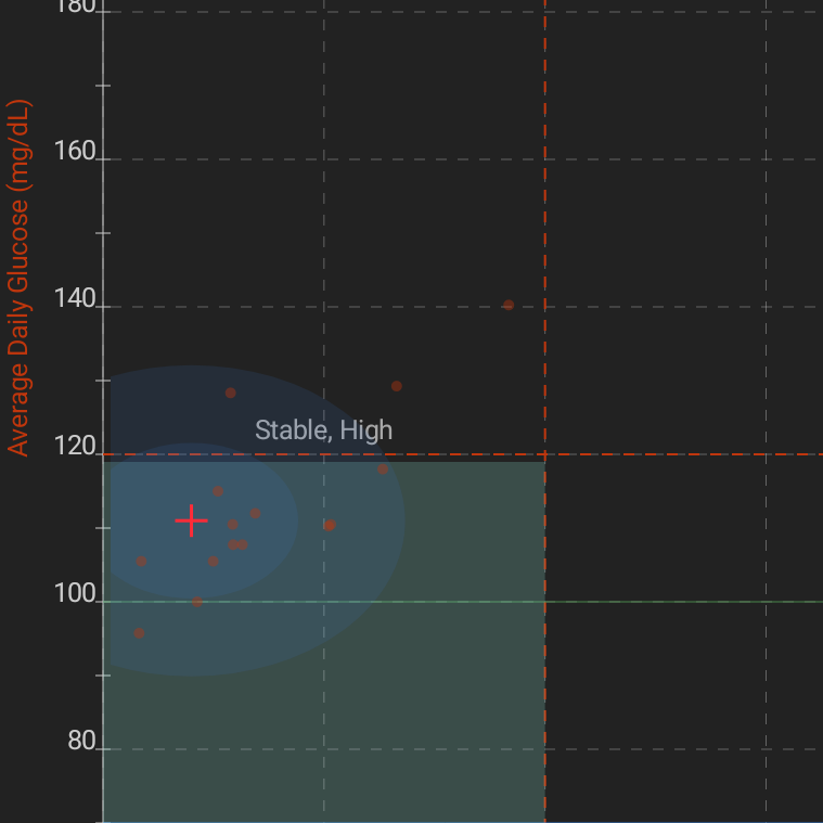
The graph and data were collected in an app called Diabetes:M. Other metrics that were cropped out of Figure 2 were:
Mean Blood Glucose (MBG): 111 mg/dL
Blood Glucose Variability (BGV): 20 mg/dL
Blood Glucose Standard Deviation (SD/MBG): 9%
One reference suggested that the overall standard deviation (SD) should be less than 1/3 (33.3%) of median blood glucose (MBG)(ref.). You can see that I’m well below that at 9%.
However, that 111 MBG is somewhat peculiar, given that it is technically in the pre-diabetic range (ref.). I’ll talk about the Dawn Phenomenon below, but I don’t think my “fasted” tests were truly fasted, they were just when things fit into my schedule and I knew I wasn’t going to be particularly ambulatory; which as we know would significantly dampen postprandial BG.
A1c is essentially a 90-day average of your BG while the former requires formal (albeit inexpensive) lab testing, the later (BG) can be tested with cheap meters readily available on Amazon or at drug stores. The results can be used in an app like Diabetes:M to estimate A1c. Diabetes:M estimated my A1C at 5.7 which is right at the cut off for pre-diabetes. However, as noted above, this data is somewhat skewed.
One paper (ref.) estimated that the odds ratio of metabolic syndrome for (elevated) HbA1c at 2.68 while it was 11.36 for (elevated) insulin, 7.03 for (elevated) glucose, and 14.4 for HOMA-IR (which is a factor of HbA1c and insulin).
The authors also write:
“The areas under the receiver operating characteristics curves for metabolic syndrome were 0.670 (across HbA1c values) and 0.770 (across insulin values), and, for insulin resistance, 0.647 (HbA1c) and 0.995 (insulin). Among non-metabolic syndrome patients, a small insulin elevation identified risk factor clustering.”
It would have been nice to have a fasting insulin level, the last time I had it tested was below 5, to balance out the A1C measurement. The point is that it’s interesting that a flyer in one of these areas doesn’t necessarily imply equal effect in the others.
That information is largely collateral that we’ll touch on later. For now, let’s look at the real target; which is how different food sources effect Area Under the Curve (AUC) of postprandial BG.
AUC = ((fasted-BG) + (BG-30 * 2) + (BG-60 * 3) + (BG-12 *2)) / 4 (ref.)
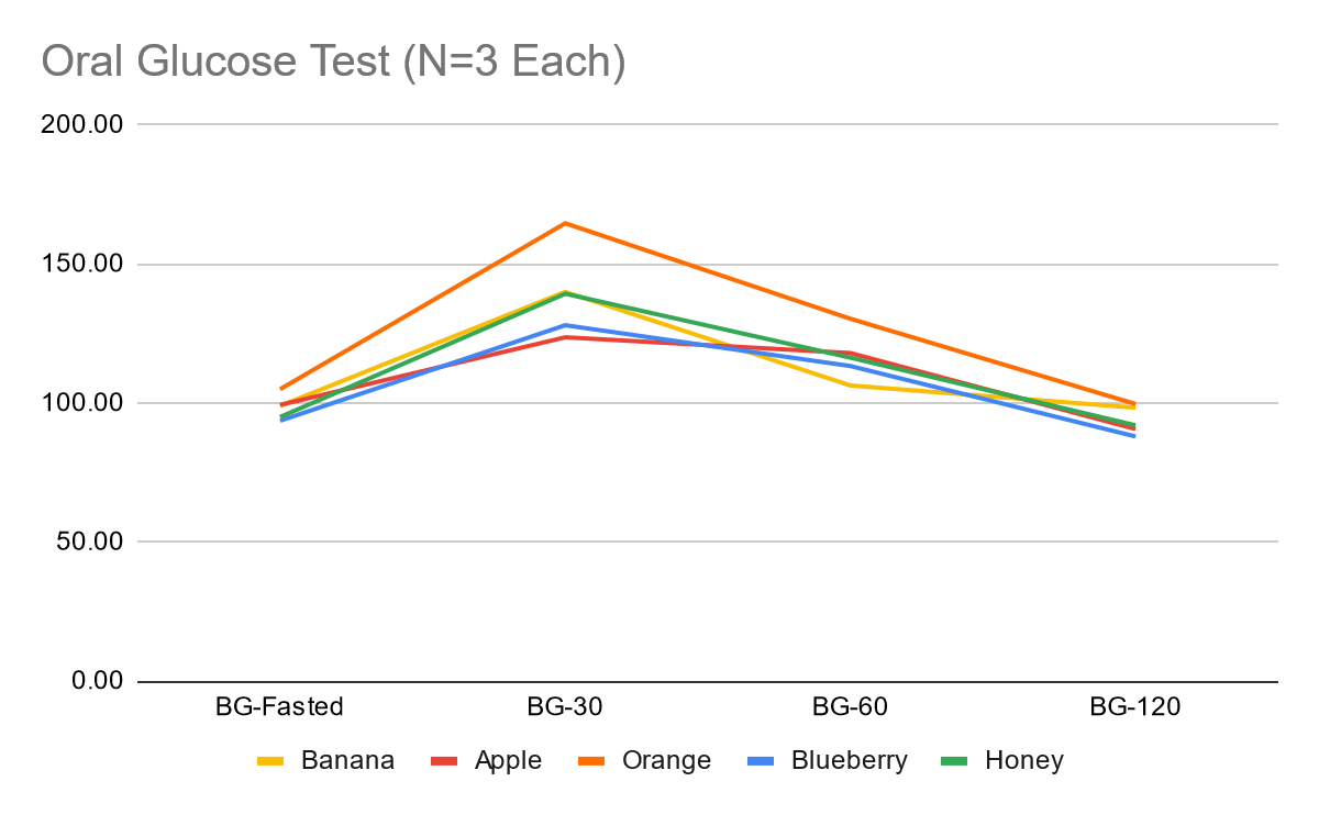
Figure 3 shows the raw blood glucose values at different postprandial intervals for the listed items. I tried to get a couple (N=3) samples for each item because sometimes I’d have to move a little more than others during the 2-hour testing period; so this variance needed accounted for.
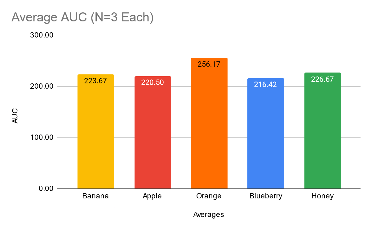
Figure 4 shows a comparison of the raw AUC values for the items above. You can see that, congruent with Figure 3, oranges had the largest value, bananas and honey were in the middle, and apples and blueberries were the lowest values.
While Figures 3 and 4 show raw values, we need to look at relative values, or AUC per gram of carbohydrate in order to have an honest comparison. Otherwise, a large bolas of carbohydrates from one source would significantly skew the results — e.g. comparing 100g of carbs from oranges to 50g of carbs from blueberries. Figure 5 shows us just that.
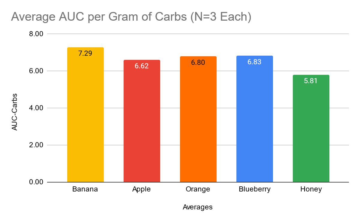
This shows us a different story with honey being by far the best, banana by far the worst, and the others pretty close in the middle. I tried to put my finger on what the difference in these numbers could be, but nothing has really stuck.
Ratios of inositol might have something to do with it (ref., ref., ref.), but I couldn’t find a complete dataset for accurate comparison. What I did find was the following:
Apple: 7.7mg Inositol / 100g
Orange: 307mg Inositol / 100g
Honey: 33mg Inositol / 100g
Just eyeballing these numbers, it doesn’t seem related.
My next thought was that perhaps glucose-to-fructose ratio had something to do with how the sugar(s) got metabolized. When I computed this, neither glucose or fructose had a significant relationships with per-carb AUC, but glucose-fructose ratio did!
However, it was not the relationship I was expecting. The relationship was positive (r = 0.26, p < 0.001) which means that as there was more glucose per fructose, there was a higher AUC value. Do note, that while this relationship was statistically significant (likely not by chance) the effect size or strength of the correlation was relatively small.
At any rate, this points to honey being the winner from this data set regarding having the smallest AUC per gram of carbohydrates. Again, it would have been nice to have a larger data set (maybe N=10) for each item, but that’s 40 finger sticks for each item to be tested — pass.
It would also be interesting to compare different recovery or training metrics. I suspect that depending on how glycogen depleted I was from the previous day’s training my muscle tissues would “soak up” the ingested carbohydrates leaving less floating around in the blood — because it’s being used for glycogen synthesis. This could also explain some of the per-gram-AUC variance found between carb sources.
Dawn Phenomenon and Sleep Quality:
Above I mentioned not being in a “true fasted” state for many of these tests due to time/ing parameters. Sometimes this was the case even when I was testing early in the morning.
I usually find myself in a bit of a training-eating-paradox because I typically train later in the evening. Usually, that means I’d like to eat after training, however, that puts my last meal pretty close to bed time. Thus, things like blood pressure, blood sugar, and body temperature go up (after eating) when they should be going down for sleep.
Not only does this mean lower quality sleep, but it also means “first thing in the morning” BG levels may not be “fasted” (ref.). Because of the late last meal, and slowed overnight metabolism, I don’t typically hit “fasted” BG levels until mid-morning or lunch time.
So, one really useful thing that came out of this study was a push to get myself to eat as whopping of a breakfast as I can, with a similar sized lunch, and keep any pre or post training feedings to “snack” proportions.
I don’t have a functioning smart watch / fitness tracker at the moment, but subjectively I feel like this has made a significant improvement in my sleep. It’s not a world changer, but I can definitely notice a difference.
Data Availability and Disclosures:
Raw Data: https://gitlab.com/savagezen/research
Annotated Data: Google Drive